Search

Wednesday, 15 September 2010

Hiding place?


Luckily there was a similar- patterned bag that could 'hide' my dragon egg camo- covered box.
it was good to see how things would blend in and was challenging.

Sunday, 12 September 2010


  • Dazzle camouflage~


/Long time no update/

Dazzle is also referred to as 'razzle dazzle painting' it was used on ships during world war1 and world war2 (although less.)-Credited to artist Norman Wilkinson
although it looks as if the paint would draw attention to the ship Dazzle but made it difficult for the enemy to estimate its type, size, speed and heading.
The use of complex shapes and contrasting colours has made Dazzle so recognizable.

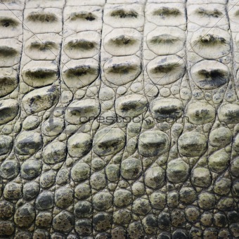
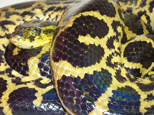
Camouflage is designed to hind and make something blend into it's surroundings to draw attention away from itself, in animals and plants it is a defense mechanism.


For an example zebras use their stripes to confuse predators when it hides behind the large grass, a moth that looks like a leaf cleverly disguises itself on a tree.

VORTICISM~
It was a small-time running British art movement from the early 20th century that consisted of interlocking shapes, it was also mentioned to be the alternative to cubism (we can clearly see the influence in the shapes and how they're placed and overlapping, the genre however grew out of cubism). Despite this it is more related to Futurism and modern and machine-like.
How it looks: In a Vorticist painting modern life is shown as an array of bold lines and harsh colours drawing the viewer's eye into the centre of the canvas. This certainly is the way and to the eye in some paintings you can't see where the painting starts or begins to end.
where did they go: The Vorticists published two issues of the literary magazine BLAST, in June 1914 and July 1915, with the work of Erza Pound.

Friday, 4 June 2010


My last dragon will be wrapped in this camo like wallpaper, I made the portion quite small so if needed I could keep adding or taking it away.

The reason for the colour- I feel like this blue can sort out my persoanlity as; calm maybe too relaxed at times, a happy cool blue. I also tried to use reference from my birthstone dragon (march birthstone is aquamarine, a light blue crystal found in some caves). I've always liked light blues and cool greys, so i ut it into this design, it could only camaflauge agains ice perhaps :)
The tips are white like the real crystal would be.
-Aquamarine-
Used quite a lot in jewellry.

My 4 chosen objects (not including final object)

I am going to use my dragon statues,
I have had them at many diffenent times in my life and and each comes from a different place or a few years apart.
1.This gold one was from Bristol but I can't remember any dates, just that I liked the look of it.
2.I have had this spyro a while and I've forgotten just where it had come from! But yeah I loved spyro games as a child so I kept the statue.
3. Nan found it from a carboot earlier this year, it looks like it's been hand-made.
4. From a shop near the Cheddar gorge caves, must have been a few years ago ;)

so yeah I like dragons, they will help me design my pattern

COLOUR

Colour is an important factor to any design it can determine and set a mood -vibrant orange can show happiness and freshness yet a murky blue may indicate sadness, in nature usaully bright colours are used sparingly and bright shades of yellow and red can mean 'stay away from me' it's used as a warning on such snakes, frogs and other animals. In design they are used as warning signals due to how eye catching they are and they make you feel alert.

Friday, 28 May 2010

The 5 Questions.

1. Who is my fav designer.
Gotta say Carson, ...surfboards were cool, his style is unique and he has inspired some of my recent projects.
2. my fav art (pieces) has to be the style of my fav manga artist (Tite Kubo) Author of Bleach.
He has unique character designs and holds a good storyline that has action and suspense.
3. Happiest (moment) well I can't mention them all but I will say that I was happy for getting my dog: Dylan.
4. My camo of choice - scales.
5. My chosen things are my dragon statues and my baby dragon I got from Bristol when I was younger (it's my birthstone for March).

SCALES - texture

This is some research towards what I'm going to be doing,
I needed to looke at scales of reptiles to learn their depth/texture/thickness.
https://blogger.googleusercontent.com/img/b/R29vZ2xl/AVvXsEhU7bVSufFi9_2sClUfW1sgelCsw6jjZzjj-A6HBVTydXqbKvZLHh1KhzPNf151SSCN_ce2bxK7saqr6OiI5j3IJsJcj3yzXU7YK2l2mBaH-g5JjOQglSJtB6QCbgISYVh5vkW87KuYK9dp/s400/hai.jpghttp://www.crestock.com/images/690000-699999/691764-xs.jpg
These are both crocodile scales, as they get close to the tail the scales become much more loose and heavier, yet when they're closer to their face the scales are more tighter and together.
http://biscottisandkangaroos.files.wordpress.com/2009/03/saltwater-crocodile.jpg
Is that lazy enough for you?
http://farm3.static.flickr.com/2243/2452690477_61e0cf643a.jpghttp://pk.b5z.net/i/u/2179965/i/Yellow_Anaconda.JPG
A snakes scales/skin is shed every so often they look much more smoother in comparison to the crocodiles earlier. Their scales aren't as bumpy and harsh to the touch. They look shiny and almost wet.
My next observation will be on COLOUR.